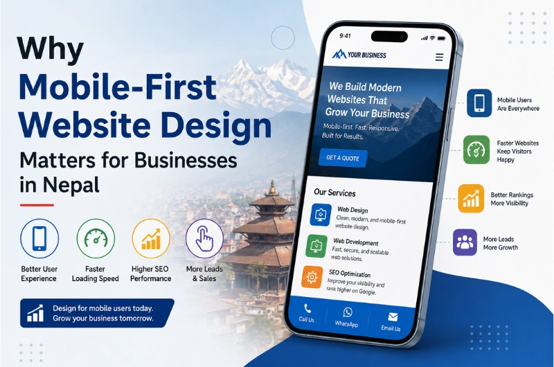
Your customers may see your website on a phone before they ever see it on a laptop.
For businesses in Nepal, this makes mobile-first website design more than a design trend. It is a practical way to build a website that works well for the people you want to reach.
People use smartphones to search for businesses, compare services, check prices, read reviews, find locations, and contact companies. A website that is hard to use on a small screen can quickly lose those visitors.
A mobile-first website starts with the mobile experience and then adapts the design for tablets, laptops, and larger screens. It focuses on simple navigation, readable text, fast loading, easy forms, and clear calls to action.
This approach can help businesses improve user experience, search visibility, and online conversions.
For businesses planning a new website or redesign, working with an experienced website design company in Nepal can help ensure the site works well across different devices and screen sizes.
What Is Mobile-First Website Design?
Mobile-first website design means designing a website for smaller screens first and then expanding the layout for larger devices.
Instead of creating a desktop website and trying to make it smaller for phones, designers begin with the mobile experience.
This means the most important content and functions are considered first:
- Business name and branding
- Main service or product information
- Navigation
- Contact details
- Call-to-action buttons
- Forms
- Location information
- Important images
- Essential content
The design can then grow to support tablets, laptops, and desktop computers.
Mobile-First vs Responsive Website Design
These terms are related but not exactly the same.
A responsive website adjusts its layout to different screen sizes.
A mobile-first website takes that idea further by starting the design process with the smallest practical screen.
| Feature | Traditional Desktop-First | Mobile-First |
|---|---|---|
| Starting point | Desktop | Mobile |
| Main focus | Large screens | Small screens first |
| Content | Often more content | Most important content first |
| Navigation | Large menus | Simple menus |
| Images | Can be larger | Optimized for performance |
| User experience | Adapted for mobile | Designed for mobile |
| Performance focus | Added later | Considered from the beginning |
| Best for | Desktop-heavy audiences | Modern multi-device audiences |
A responsive website is important, but a mobile-first approach helps make sure the mobile experience is not treated as an afterthought.
Why Mobile-First Website Design Matters in Nepal
Nepal has a large and growing digital audience. DataReportal’s Digital 2026 report says Nepal had 16.6 million internet users at the end of 2025, with internet penetration at 56 percent. It also reported 32.4 million cellular mobile connections, equivalent to 109 percent of the country’s population. (DataReportal – Global Digital Insights)
Mobile connections are not the same as individual mobile users, but the numbers show how important mobile devices are in Nepal’s digital environment.
For businesses, this creates a simple question:
Can customers easily use your website from their phones?
If the answer is no, you may be making it harder for potential customers to contact you, understand your services, or complete an action.
1. Your Customers Are Already Using Mobile Devices
People do not always sit at a computer when they need information.
A customer might search for:
- “restaurant near me”
- “IT company in Kathmandu”
- “best hotel in Pokhara”
- “website design company in Nepal”
- “digital marketing company Nepal”
- “computer repair near me”
They may perform these searches while travelling, shopping, waiting for a bus, sitting at home, or working.
A mobile-first website makes it easier for these visitors to get the information they need.
What Mobile Visitors Usually Want
Most visitors do not want to study your entire website.
They often want a quick answer.
For example:
A customer visiting a hotel website may want:
- Room prices
- Photos
- Location
- Available facilities
- Contact number
- Booking option
A customer visiting an IT company website may want:
- Services
- Portfolio
- Pricing information
- Company details
- Client reviews
- Contact form
A mobile-first design puts these important actions within easy reach.
2. Mobile-First Design Improves User Experience
A good website should feel easy to use.
Visitors should not need to zoom in, rotate their phone, or swipe sideways to read your content.
A mobile-first website focuses on:
- Easy-to-read text
- Simple navigation
- Proper spacing
- Touch-friendly buttons
- Clear headings
- Short content sections
- Easy-to-use forms
- Fast-loading pages
- Properly sized images
These small details can make a big difference.
If someone has to pinch the screen to read your phone number or struggles to tap a small menu button, they may leave the website.
3. It Can Help Your Website Perform Better in Search
Google uses the mobile version of a website’s content for indexing and ranking. This makes a strong mobile experience an important part of modern SEO.
A mobile-first approach also encourages businesses to think about performance, content structure, and usability from the start.
For example, a well-planned mobile website can have:
- Clear page structure
- Simple navigation
- Proper heading hierarchy
- Optimized images
- Fast-loading resources
- Easy-to-read content
- Strong internal linking
- Useful calls to action
These factors support both users and search engines.
Mobile-Friendly Does Not Mean “Good Enough”
Simply making a desktop website fit on a phone is not always enough.
A website can technically work on mobile while still providing a poor experience.
For example:
A desktop menu may technically fit on mobile, but a long navigation menu can still be difficult to use.
Mobile-first design asks a better question:
What does the visitor actually need on a small screen?
4. Faster Websites Can Keep Visitors Engaged
Mobile users can be sensitive to slow websites.
Large images, unnecessary scripts, heavy animations, and poorly optimized code can increase loading time.
A mobile-first design usually encourages developers to control these elements early.
Common Ways to Improve Mobile Website Speed
A business website can improve performance by:
- Compressing images.
- Using modern image formats where appropriate.
- Removing unnecessary plugins and scripts.
- Minifying CSS and JavaScript.
- Using browser caching.
- Choosing reliable web hosting.
- Loading only the resources a page needs.
- Reducing unnecessary animations.
- Using a content delivery network when appropriate.
- Testing important pages on real mobile devices.
Speed matters because visitors may not wait for a page that takes too long to load.
5. Mobile-First Design Makes Calls to Action Easier
Every business website has an action it wants visitors to take.
It could be:
- Call the business
- Send an inquiry
- Request a quotation
- Book an appointment
- Buy a product
- Send a WhatsApp message
- Fill out a contact form
- Visit a physical location
On mobile, these actions should be easy to find and use.
For example, a service company could place a Request a Quote button near the top of the page.
A restaurant could use a Call Now or Book a Table button.
An ecommerce business could make Add to Cart and Buy Now buttons easy to tap.
Good mobile-first website design connects the user’s needs with the business goal.
6. Simple Navigation Helps Visitors Find Information Faster
Large desktop menus do not always work well on phones.
Mobile-first websites often use a compact navigation system, such as a hamburger menu.
But the menu itself is only part of the solution.
The navigation should also have a clear structure.
For example:
Home → About → Services → Portfolio → Blog → Contact
A large business website may need more categories, but the principle remains the same:
Do not make mobile visitors work to find important information.
7. Mobile-First Design Builds Trust
A website is often the first impression customers have of a business.
An outdated or difficult-to-use website can make a business look less professional.
This can be especially important for:
- Hotels
- Restaurants
- Banks and financial companies
- Educational institutions
- NGOs
- Consulting firms
- IT companies
- Construction companies
- Real estate businesses
- Ecommerce stores
- Professional service providers
A clean mobile experience shows that the business cares about its customers.
Trust is not created by design alone, but a poor website can quickly damage it.
8. It Supports Local Business Searches in Nepal
Mobile devices are particularly useful for local searches.
Someone looking for a business in Kathmandu may search for a service while they are already travelling around the city.
For example:
- Web design company in Kathmandu
- Restaurant in Thamel
- Hotel near Kathmandu airport
- Printing company near me
- IT support in Kathmandu
- Dental clinic in Lalitpur
A mobile-friendly website makes it easier for visitors to check your business information and take action.
For local businesses, your website should make important information easy to find:
- Address
- Phone number
- Opening hours
- Google Maps location
- Services
- Pricing where appropriate
- Contact options
9. Mobile-First Websites Work Across Different Screen Sizes
People do not all use the same phone.
Your visitors may use:
- Small Android phones
- Large Android phones
- iPhones
- Tablets
- Laptops
- Desktop computers
A mobile-first website should adapt to different screen sizes.
This is where responsive design becomes important.
Responsive Design Should Cover More Than Width
A strong responsive website should consider:
- Screen width
- Screen height
- Touch interaction
- Font size
- Image dimensions
- Navigation
- Button size
- Form fields
- Content spacing
- Orientation
The goal is not simply to make everything smaller.
The goal is to make the website comfortable to use.
10. Mobile-First Design Can Improve Lead Generation
A website is not only an online brochure.
For many businesses, it is a source of leads.
Suppose a visitor searches Google for a service and reaches your website from a phone.
If the page is easy to read, loads quickly, explains the service clearly, and has an obvious contact button, the visitor has a clear path to becoming a lead.
But if the page has:
- Tiny text
- Slow loading
- Difficult navigation
- Broken layouts
- Hard-to-use forms
- Missing contact information
the visitor may leave before contacting you.
Mobile-first design removes many of these unnecessary barriers.
11. It Makes Forms Easier to Complete
Forms can be frustrating on mobile devices.
A long form with too many fields can discourage users.
Instead, ask only for information you actually need.
For example, a simple service inquiry form could ask for:
- Name
- Email or phone
- Service required
- Message
You can also use mobile-friendly input types.
For example:
- Phone fields should open the numeric keypad.
- Email fields should support easy email entry.
- Dropdowns should be easy to tap.
- Buttons should be large enough to use comfortably.
Small improvements can make forms much easier to complete.
12. Mobile-First Design Helps Ecommerce Websites
For online stores, mobile usability can directly affect sales.
Customers may discover products through:
- TikTok
- Search ads
- Shared links
- Messaging apps
Many of these interactions happen on mobile devices.
An ecommerce website should make it easy to:
- Find a product.
- View product images.
- Read product information.
- Check price and availability.
- Select options.
- Add the product to the cart.
- Enter delivery information.
- Complete payment.
A complicated mobile checkout can lead to abandoned carts.
13. Mobile-First Design Is Useful for Social Media Traffic
Social media is an important source of website traffic for many businesses in Nepal.
DataReportal reported 14.8 million social media user identities in Nepal in October 2025. (DataReportal – Global Digital Insights)
When someone clicks a link from Facebook, Instagram, LinkedIn, or another platform, they are often using a phone.
That means your social media traffic and website experience need to work together.
For example:
Facebook post → Website landing page → Service information → Contact button
If the landing page is difficult to use on mobile, your social media efforts may not perform as well as expected.
Mobile-First Website Design Best Practices
A good mobile-first website should follow a few basic rules.
1. Keep Navigation Simple
Use clear menu labels and avoid unnecessary menu items.
2. Use Readable Fonts
Text should be comfortable to read without zooming.
3. Make Buttons Easy to Tap
Important buttons need enough size and spacing for touch users.
4. Keep Content Focused
Put the most useful information first.
5. Optimize Images
Large images can slow down mobile pages.
6. Reduce Unnecessary Pop-Ups
Pop-ups can be difficult to close on small screens.
7. Make Contact Information Easy to Find
Phone numbers, email addresses, and location information should be accessible.
8. Test Real Devices
Do not rely only on a desktop browser.
Test your website on different phones and tablets.
9. Keep Forms Short
Only request information you really need.
10. Test Page Speed
Check important landing pages, service pages, and product pages.
Common Mobile Website Mistakes Businesses Should Avoid
Even responsive websites can have mobile usability problems.
Here are some common mistakes:
| Mistake | Why It Matters |
|---|---|
| Tiny text | Users struggle to read |
| Small buttons | Difficult to tap |
| Large images | Can slow down pages |
| Too many pop-ups | Interrupts the user |
| Long forms | Reduces form completion |
| Complex menus | Makes navigation difficult |
| Horizontal scrolling | Creates a poor experience |
| Autoplay video | Can consume data and distract users |
| Desktop-only features | May not work well on phones |
| Hidden contact details | Makes it harder to contact the business |
Avoiding these problems can make your website much easier to use.
How to Build a Mobile-First Website for Your Business
If you are planning a new website, start with the mobile experience instead of treating it as a final step.
Step 1: Identify Your Main Users
Think about who visits your website.
Are they:
- Local customers?
- Tourists?
- Business owners?
- Students?
- Professionals?
- Existing customers?
- People searching for your services?
Understanding your audience helps you decide what should appear first.
Step 2: Define the Main Goal
Decide what you want visitors to do.
For example:
Service business: Request a quotation
Hotel: Make a booking
Restaurant: View menu or make a reservation
School: Submit an admission inquiry
Ecommerce store: Buy a product
The design should support this goal.
Step 3: Prioritize Content
Put important information first.
Do not make visitors scroll through several sections just to find your phone number or main service.
Step 4: Create the Mobile Layout
Design the core pages for a small screen.
Focus on:
- Navigation
- Typography
- Buttons
- Images
- Forms
- Content spacing
- Calls to action
Step 5: Expand for Larger Screens
Once the mobile layout works well, adapt it for tablets, laptops, and desktops.
Step 6: Test and Improve
Test the website using different devices and browsers.
Check:
- Page loading
- Navigation
- Forms
- Buttons
- Images
- Text
- Contact links
- Checkout
- Maps
- Browser compatibility
Mobile-First Website Design vs Mobile-Friendly Website
These terms are sometimes used interchangeably, but there is a useful difference.
A mobile-friendly website is designed to work on mobile devices.
A mobile-first website is designed with mobile users as a starting priority.
For example, a desktop-first website may contain a large banner, multiple columns, a complex menu, and several decorative elements. Developers may then adjust these features for mobile.
With a mobile-first approach, the designer first asks:
“What does the visitor need to see and do on a phone?”
The desktop version can then add more space and features without making the mobile experience complicated.
Why Businesses in Nepal Should Choose a Mobile-First Approach
For a new website, mobile-first design can be a smart long-term choice.
It helps businesses focus on the essentials:
- Better mobile usability
- Cleaner layouts
- Faster pages
- Easier navigation
- Clearer calls to action
- Better accessibility
- Stronger content structure
- Easier testing across devices
It also helps avoid a common problem: spending time and money creating a desktop design and then discovering that the mobile version needs major changes.
Starting with mobile can reduce that risk.
How a Website Design Company in Nepal Can Help
Building a professional website involves more than choosing a template and adding content.
A professional website design team can help with:
- Website planning
- User experience design
- Mobile-first layouts
- Responsive development
- Content structure
- SEO-friendly design
- Website speed
- Contact forms
- Landing pages
- Ecommerce features
- Website testing
- Maintenance
If your business is planning a new website, you can link this article to your Website Design Company in Nepal service page using the anchor text website design company in Nepal.
Internal Link Opportunity: Website Design Company in Nepal → Add your relevant Webtech Nepal service page link here.
What Should a Mobile-First Business Website Include?
A typical business website should include the following:
| Website Element | Mobile-First Consideration |
|---|---|
| Header | Simple and easy to use |
| Navigation | Compact and clear |
| Hero section | Short message and clear CTA |
| Services | Easy-to-scan sections |
| About | Concise and useful |
| Portfolio | Optimized images |
| Testimonials | Easy to read |
| Contact | Phone, email, form, and location |
| Footer | Useful links without clutter |
| Images | Compressed and responsive |
| Forms | Short and touch-friendly |
| Buttons | Large enough to tap |
The exact structure depends on the business and its customers.
Key Takeaways
Here are the main reasons mobile-first website design matters for businesses in Nepal:
- Many people access the internet through mobile devices.
- Mobile users expect websites to be easy to use.
- Simple mobile navigation improves usability.
- Optimized images can help reduce page load time.
- Clear calls to action can make it easier for visitors to contact you.
- Mobile-friendly forms can improve inquiries.
- Local businesses can make contact and location information easier to access.
- Ecommerce stores can create a better shopping experience.
- Social media visitors often arrive through mobile devices.
- Mobile-first design supports a better experience across different screen sizes.
Frequently Asked Questions
What is mobile-first website design?
Mobile-first website design is an approach where the website is designed for mobile screens first and then adapted for larger screens such as tablets, laptops, and desktops.
Why is mobile-first website design important for businesses in Nepal?
It helps businesses provide a better experience for people who access websites using smartphones. It can also support usability, website performance, SEO, and lead generation.
Is mobile-first design the same as responsive design?
No. Responsive design makes a website adapt to different screen sizes. Mobile-first design starts the design process with mobile users and then expands the experience for larger screens.
Does mobile-first design help SEO?
A good mobile experience supports modern SEO because Google uses the mobile version of website content for indexing and ranking. Mobile usability is therefore an important part of a well-built website.
How do I know if my website is mobile-friendly?
Open your website on several phones and check whether the text is readable, buttons are easy to tap, menus work correctly, images fit the screen, and forms are easy to complete. You should also test important pages using Google’s current web performance and search tools.
How much does mobile-first website design cost in Nepal?
The cost depends on the website’s size, design requirements, features, content, ecommerce needs, integrations, and development approach. A simple business website will usually require less work than a large ecommerce or custom web application.
Should I redesign my existing website for mobile?
If your website is difficult to use on phones, loads slowly, has poor navigation, or has an outdated layout, a redesign may be worthwhile. A website audit can help identify the biggest problems before you decide.
Can an existing website be converted to mobile-first design?
Yes. Some websites can be improved through responsive design and performance changes, while older websites may benefit more from a complete redesign.
What is the difference between mobile-first and desktop-first website design?
Desktop-first design begins with the large-screen experience and adapts it for smaller screens. Mobile-first design starts with the mobile experience and then expands it for larger devices.
Conclusion
Mobile-first website design matters for businesses in Nepal because your customers are increasingly using mobile devices to find information, compare businesses, and take action online.
A good mobile website should be fast, simple, readable, easy to navigate, and focused on the actions your customers need to take.
If you are building a new website, start with the mobile experience instead of adding mobile support at the end. If you already have a website, check how it performs on real phones and identify areas that need improvement.
For businesses looking for professional website planning, design, and development, Webtech Nepal can help create a website built around your business goals and customer needs.